Skip the tutorial and deploy the example now
Deploy a Dash Application to Connect Cloud

This tutorial builds a Dash application and deploys it to Posit Connect Cloud. Code for the application is available on GitHub.
1. Create a new repo
Sign in to GitHub and create a new, public repository.
2. Start a new project
Start a new project in your preferred development environment. In VS Code, for example, select New Window from the File Menu and then click Start >> Clone Git Repository. Paste the link to your new repository.
3. Create a virtual environment
In the terminal, create a virtual environment named venv and activate it. This will isolate the specific packages we need for the application.
python -m venv venv
source venv/bin/activate
4. Install required packages
dash
dash_bootstrap_components
plotly
pandas
This example makes use of the above Python packages and they need to be installed in your virtual environment.
Create a requirements.txt file, adding each package on a new line. This file helps install everything the application needs to run locally and will ultimately tell Connect Cloud what it needs to deploy the application.
Once you have saved requirements.txt, run the following command in the terminal to install all the packages into your virtual environment.
pip install -r requirements.txt5. Build the application
Create a new file named app.py. Copy and paste the following code into the file.
# -*- coding: utf-8 -*-
import os

import dash
import dash_bootstrap_components as dbc
from dash import dash_table, dcc, html
from dash.dependencies import Input, Output
import pandas as pd
import plotly.express as px

MIN_DATE = pd.Timestamp(2010, 1, 4, 0).date()
MAX_DATE = pd.Timestamp(2018, 11, 7, 0).date()

app = dash.Dash(__name__, external_stylesheets=[dbc.themes.BOOTSTRAP])

# Fetch prices from local CSV using pandas
prices = pd.read_csv(
    os.path.join(os.path.dirname(__file__), "prices.csv"),
    # index_col=0,
    parse_dates=True,
    date_format="%Y-%m-%d",
)

prices["date"] = pd.to_datetime(prices["date"], format="%Y-%m-%d")
tickers = prices["ticker"].unique()

# Dataframe with top 5 volumes for each ticker
max_vol = (
    prices.set_index(["date"]).groupby("ticker")["volume"].nlargest(1).reset_index()
)
min_vol = (
    prices.set_index(["date"]).groupby("ticker")["volume"].nsmallest(1).reset_index()
)
extreme_vol = pd.concat([max_vol, min_vol])
extreme_vol.columns = ["Stock", "Date", "Top and Lowest Volumes"]

# top nav bar
nav = dbc.Navbar(
    children=[
        dbc.Row(
            [
                dbc.Col(dbc.NavbarBrand("Stock Tracker", className="ml-2")),
            ],
            align="center",
            className="g-0",
        ),
    ],
    sticky="top",
)

# left side grouping of selction options
form_card_group = dbc.Card(
    [
        dbc.Row(
            [
                dbc.Label("Choose a Stock Symbol", width=10),
                dbc.Col(
                    dcc.Dropdown(
                        id="stock-ticker-select",
                        options=[
                            {
                                "label": ticker,
                                "value": ticker,
                            }
                            for ticker in tickers
                        ],
                        multi=True,
                        value=[tickers[0]],
                    ),
                ),
            ]
        ),
        dbc.Row(
            [
                dbc.Label("Price", width="auto"),
                dbc.Col(
                    dbc.RadioItems(
                        id="stock-ticker-price",
                        options=[
                            {
                                "label": "Open",
                                "value": "open",
                            },
                            {
                                "label": "High",
                                "value": "high",
                            },
                            {
                                "label": "Low",
                                "value": "low",
                            },
                            {
                                "label": "Close",
                                "value": "close",
                            },
                        ],
                        value="close",
                    ),
                    width=10,
                ),
            ]
        ),
        html.Div(
            [
                dcc.Markdown(
                    """
Selecting data in the **price** graph
will adjust the x-axis date range in the bottom **volume** graph.
"""
                ),
                html.Pre(id="selected-data"),
            ],
        ),
    ],
    body=True,
)

# sidebar
SIDEBAR_STYLE = {
    "float": "left",
    "top": "50px",
    "left": 0,
    "bottom": 0,
    "width": "28rem",
    "padding": "2rem 1rem",
}

sidebar = html.Div(
    form_card_group,
    style=SIDEBAR_STYLE,
)

# price and volume graphs
graphs = [
    dbc.Alert(
        "📊 Hover over the charts to highlight data points and show graph utilities. "
        "All data is historical.",
        color="info",
    ),
    dcc.Graph(id="stock-price-graph", animate=True),
    dcc.Graph(
        id="stock-volume-graph",
        animate=True,
    ),
]

max_table_dash = dash_table.DataTable(
    data=max_vol.to_dict("records"),
    style_as_list_view=True,
    fill_width=False,
    style_table={"float": "left"},
    style_cell={
        "height": "auto",
        # all three widths are needed
        "minWidth": "180px",
        "width": "180px",
        "maxWidth": "180px",
        "whiteSpace": "normal",
        "padding-right": "30px",
        "padding-left": "10px",
        "text-align": "center",
    },
    style_data={"color": "black", "backgroundColor": "white"},
    style_data_conditional=[
        {
            "if": {"row_index": "odd"},
            "backgroundColor": "rgb(220, 220, 220)",
        }
    ],
    style_header={
        "backgroundColor": "rgb(210, 210, 210)",
        "color": "blue",
        "fontWeight": "bold",
    },
)

body_container = dbc.Container(
    [
        html.Div(
            children=[
                dbc.Row(
                    [
                        dbc.Col(
                            sidebar,
                            md=4,
                        ),
                        dbc.Col(
                            graphs,
                            md=8,
                        ),
                    ],
                ),
            ],
            className="m-4",
        ),
        html.Div(
            [
                dbc.Row(
                    [
                        dbc.Col(
                            [
                                dcc.Graph(
                                    id="scatter-plot",
                                    style={"float": "left"},
                                ),
                            ]
                        ),
                        dbc.Col([max_table_dash]),
                    ],
                ),
            ],
        ),
    ],
    fluid=True,
)

# main app ui entry
app.layout = html.Div([nav, body_container])


def filter_data_by_date(df, ticker, start_date, end_date):
    """Apply filter to the input dataframe

    Args:
        df: dateframe to filter
        ticker: stock ticker symbol for filter criteria
        start_date: min date threshold
        end_date: max date threshold
    Returns:
        a filtered dataframe by ticker and date range
    """
    if start_date is None:
        start_date = MIN_DATE

    if end_date is None:
        end_date = MAX_DATE

    filtered = df[
        (df["ticker"] == ticker) & (df["date"] >= start_date) & (df["date"] <= end_date)
    ]
    return filtered


def volume_figure_layout(selected_tickers, xaxis_range=None):
    """Add layout specific to x-axis

    Args:
        selected_tickers: stock tickers for title
        xaxis_range: `dict` with layout.xaxis.range config
    Returns:
        a layout dict
    """
    layout = dict(xaxis={}, yaxis={})
    layout["title"] = "Trading Volume (%s)" % (" & ").join(selected_tickers)
    layout["yaxis"] = {"autorange": True}
    layout["yaxis"]["title"] = "Volume"
    layout["xaxis"]["title"] = "Trading Volume by Date"

    if xaxis_range:
        layout["xaxis"]["range"] = xaxis_range
        layout["xaxis"]["autorange"] = True

    return layout


@app.callback(
    Output("stock-price-graph", "figure"),
    [
        Input("stock-ticker-select", "value"),
        Input("stock-ticker-price", "value"),
    ],
)
def update_price_figure(tickers, price):
    """Create a plot of stock prices

    Args:
        tickers: ticker symbols from the dropdown select
        price: the radio button price selection
    Returns:
        a graph `figure` dict containing the specificed
        price data points per stock
    """

    return {
        "data": [
            {
                "x": [date for date in prices.loc[(prices.ticker == stock)]["date"]],
                "y": [p for p in prices.loc[(prices.ticker == stock)][price]],
                "type": "scatter",
                "mode": "lines",
                "name": stock,
            }
            for stock in tickers
        ],
        "layout": {
            "title": "Stock Price - (%s)" % " & ".join(tickers),
            "xaxis": {"title": "Date"},
            "yaxis": {"title": "Price"},
        },
    }


@app.callback(
    Output("stock-volume-graph", "figure"),
    [
        Input("stock-ticker-select", "value"),
        Input("stock-price-graph", "relayoutData"),
    ],
)
def update_volume_figure(selected_tickers, relayoutData):
    """Create a plot of stock volume

    Args:
        selected_tickers: ticker symbols from the dropdown select
        relayoutData: data emitted from a `selection` on the price graph
    Returns:
        a graph `figure` dict containing the specificed
        volume data points per stock within the relayoutData
        date range.
    """

    data = []
    from_date = None
    to_date = None

    if relayoutData:
        from_date = relayoutData.get("xaxis.range[0]", None)
        to_date = relayoutData.get("xaxis.range[1]", None)

        if from_date and to_date:
            from_date = pd.Timestamp(from_date)
            to_date = pd.Timestamp(to_date)

            for stock in selected_tickers:
                filtered = filter_data_by_date(prices, stock, from_date, to_date)
                data.append(
                    {
                        "x": filtered["date"],
                        "y": filtered["volume"],
                        "type": "bar",
                        "name": stock,
                    }
                )

            xaxis_range = [from_date, to_date]

            return {
                "data": data,
                "layout": volume_figure_layout(selected_tickers, xaxis_range),
            }

        else:
            data = [
                {
                    "x": [item for item in prices[(prices.ticker == stock)]["date"]],
                    "y": [item for item in prices[(prices.ticker == stock)]["volume"]],
                    "type": "bar",
                    "name": stock,
                }
                for stock in selected_tickers
            ]

            # default dates
            xaxis_range = [MIN_DATE, MAX_DATE]

            return {
                "data": data,
                "layout": volume_figure_layout(selected_tickers, xaxis_range),
            }

    return {"data": data, "layout": volume_figure_layout(selected_tickers)}


@app.callback(
    Output("scatter-plot", "figure"),
    [
        Input("stock-ticker-select", "value"),
        Input("stock-ticker-price", "value"),
    ],
)
def update_scatter_plot(all_tickers, price):
    dfs = []
    if len(list(all_tickers)) < 2:
        for stock in ["AAPL", "AMZN", "FB", "GOOG", "INTC", "MSFT"]:
            temp = prices.loc[(prices["ticker"] == stock)]
            temp = temp.loc[temp.date >= "2012-05-18"]
            dfs.append(temp)

        final = pd.concat(dfs, ignore_index=True)
        final["daily ret"] = (final["close"] - final["open"]) * 100 / final["open"]
        final = final[["date", "ticker", "daily ret"]]

        unique_dates = pd.unique(temp["date"])
        date_final = pd.DataFrame({"Date": unique_dates})

        for stock in ["AAPL", "AMZN", "FB", "GOOG", "INTC", "MSFT"]:
            col_name = stock
            date_final[col_name] = final.loc[final["ticker"] == stock][
                "daily ret"
            ].values
        ret_list = date_final.columns[1:]
        fig = px.scatter_matrix(date_final, dimensions=ret_list)
        fig.update_traces(diagonal_visible=False)
        fig.update_layout(title={"text": "Return Price Scatter Plot"})
    else:

        for stock in all_tickers:
            temp = prices.loc[(prices["ticker"] == stock)]
            temp = temp.loc[temp.date >= "2012-05-18"]
            dfs.append(temp)

        final = pd.concat(dfs, ignore_index=True)
        final["daily ret"] = (final["close"] - final["open"]) * 100 / final["open"]
        final = final[["date", "ticker", "daily ret"]]

        unique_dates = pd.unique(temp["date"])
        date_final = pd.DataFrame({"Date": unique_dates})

        for stock in all_tickers:
            col_name = stock
            date_final[col_name] = final.loc[final["ticker"] == stock][
                "daily ret"
            ].values

        ret_list = date_final.columns[1:]
        fig = px.scatter_matrix(date_final, dimensions=ret_list)
        fig.update_traces(diagonal_visible=False)
        fig.update_layout(title={"text": "Return Price Scatter Plot"})

    return fig


if __name__ == "__main__":
    app.run_server()
6. Preview the application
From the terminal, run the following command.
python app.py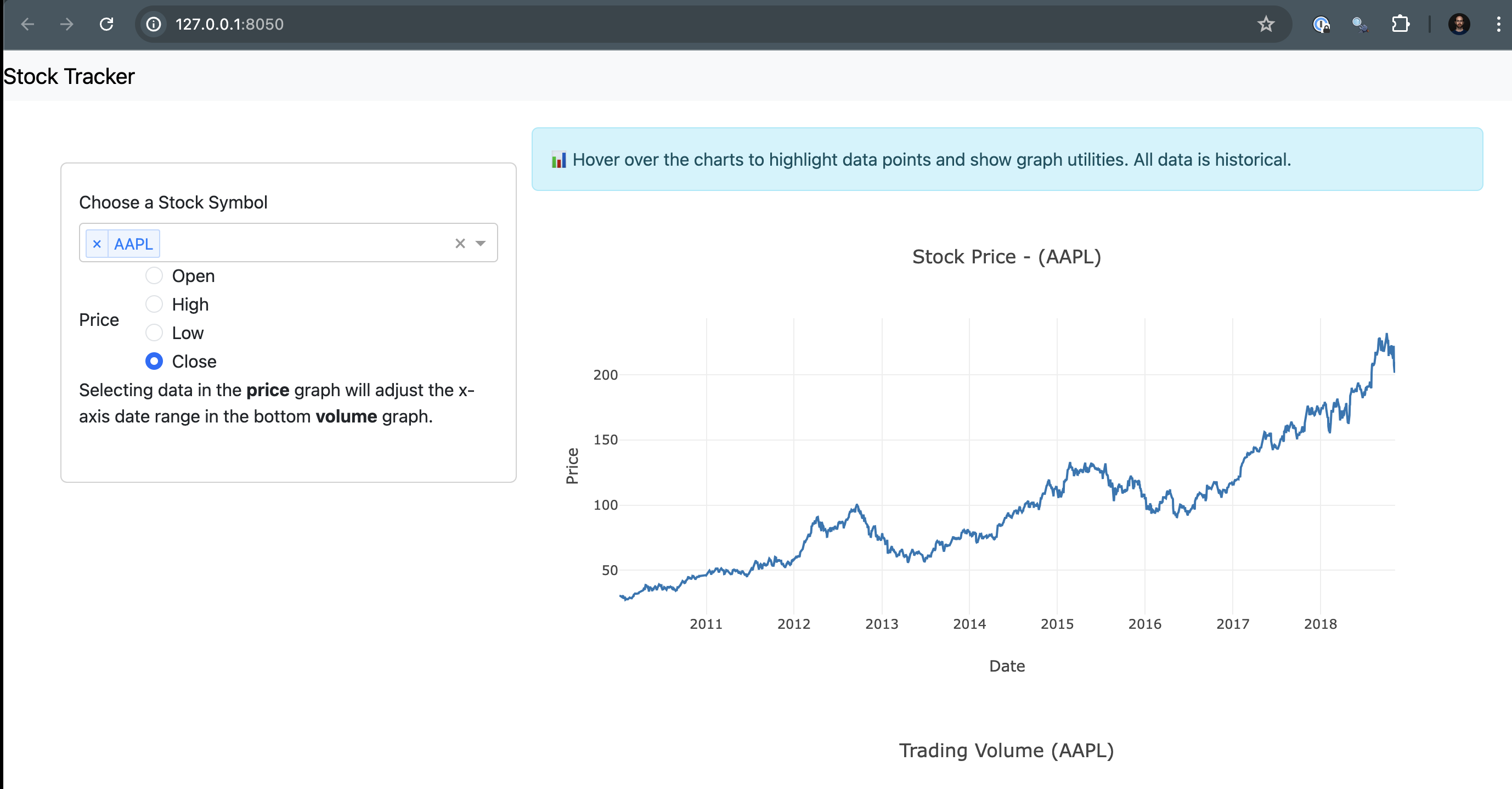
Now that everything looks good and we’ve created a file to help reproduce your local environment, it is time to get the code on GitHub.
7. Push to GitHub
Before syncing your project with the new repository, create a .gitignore file so that you don’t add the virtual environment to the repo.
touch .gitignore
Add the virtual environment folder to the .gitignore file.
venv/
You are now ready to sync the project with your new repo. Run the following lines in the terminal, replacing https://github.com/account-name/repo-name.git with your repository’s link.
git init .
git commit -m "first commit"
git branch -M main
git remote add origin https://github.com/account-name/repo-name.git
git push -u origin main
Finally, refresh your GitHub repository page. You should see everything that was in your local directory with the exception of the virtual environment folder, which was excluded in the .gitignore file.
8. Deploy to Posit Connect Cloud
Follow the steps below to deploy your project to Connect Cloud.
Sign in to Connect Cloud.
Click the Publish icon button on the top of your Home page
Select Dash
Select the public repository that you created in this tutorial
Confirm the branch
Select app.py as the primary file
Click Publish
Publishing will display status updates during the deployment process. You will also find build logs streaming on the lower part of the screen.
Congratulations! You successfully deployed to Connect Cloud and are now able to share the link with others.
9. Republish the application
If you update the code to your application or the underlying data source, commit and push the changes to your GitHub repository.
Once the repository has the updated code, you can republish the application on Connect Cloud by going to your Content List and clicking the republish icon.